A couple of friends have asked me about the nuts and bolts of how I put a Nowhere Band strip together; I’m in kind of a dead spot as I recover from a vacation and wait for class to start, so I thought now would be a good time to do a quick walkthrough of the process. So (click on all pictures to embiggen):
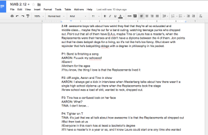 STEP 1 : SCRIPT

Naturally, I start with a script. Actually, that’s not true. I start with a vague idea that gets jotted down in a notebook or a google doc, and then fluffed out to a badly-written paragraph with chunks of dialogue embedded, and then on to a full-on script.
My scripts are pretty minimal (and casual as far as spelling and grammar and those niceties), since I’m just writing for myself and I’ve already internalized all kinds of strip conventions about locations, expressions, gestures, and such. At this point, it’d be really weird to write a script for someone else to draw. I should try it some time.
The hardest thing in the script stage is making sure lines of dialogue don’t get too long to fit gracefully into balloons. I can get pretty wordy – I still basically think of myself as a writer who sort of knows how to draw – so this is a challenge.
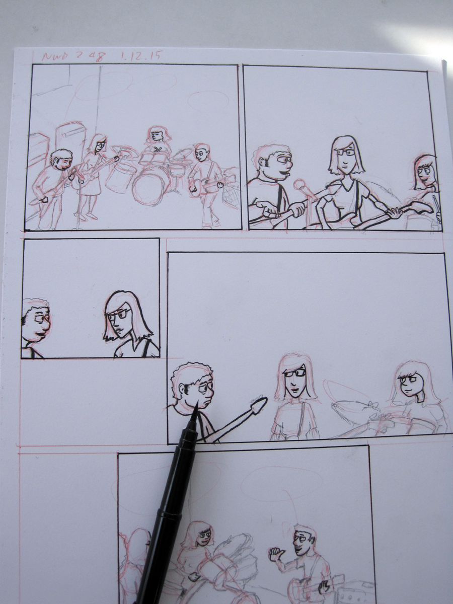
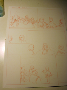 STEP 2 : REDLINE

This is the worst step; in any sort of creative work, the hardest part is sitting down and facing a blank piece of paper, and that’s what’s going on here. Everything after this point is basically a form of editing and refinement, cleaning up or enhancing something that already exists. Here, I’m wrestling something into existence. Mornings when I wake up and have to go downstairs and do redlines are the times I’m most tempted to sleep in or volunteer to walk the dog on Rebecca’s day of the rotation.
Anyway: I start out by laying out the panel grid in red pencil (doing this stage in red makes it easy to remove all of this rough early work in Photoshop once the strip’s scanned). The script’ll tell me how many panels I need (I try to keep it around 5, give or take a couple, but different strips need different lengths). Relative panel size usually comes down to a function of how much dialog is in a given panel (remember, I get wordy), how big a thing or space needs to be shown, or how many characters appear.
I also have this weird compulsion to make the overall panel layout sort of symmetrical, and to avoid strings of panels the same size. These are dumb complications, but I can’t really fight them.
 Once the panels are drawn, I rough in the characters as stick figures, usually starting with their heads. I use an ellipse template to keep people’s heads roughly the same size, allowing for skull variance (seriously, my art got a ton better once I started thinking about what everyone’s skull looked like and used an ellipse template to enforce some sort of size parity; Aaron’s got the biggest, widest head – a fat ellipse on its side – and Tina’s got the narrowest – a thin, vertical ellipse) and then draw out bodies as stick figures, trying to get proportions, postures, and gestures as right as possible. Backgrounds and musical instruments get roughed in as well here.
There are a lot of things to consider as all of this is happening. For instance, left-right placement can be tough. If possible/practical, you generally want the character who’s speaking first to be on the left side of the panel, to keep word balloons from getting tangled. But I’ve got to deal with established continuity of how the Awesome Boys’ practice space is laid out. Dealing with this ties into the second big concern, camera angle (I know, I know, comics and film aren’t the same thing, but the camera’s a very handy metaphor. Roll with me here). I like to vary my camera angle a little to keep the strip from getting to visually boring when it’s just a bunch of people talking; creative camera angles can also help deal with tricky left-right placement issues.
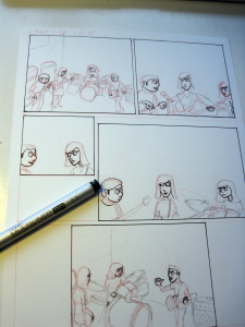
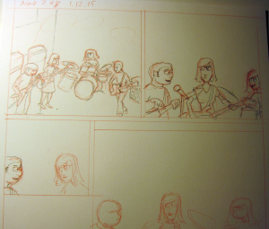 STEP 3: PENCIL

Here I switch from red pencil to regular, and turn the rough redlined stick figures into a real drawing. Like I said before, this is way, way easier, since it’s really just a question of refinement. More than anything, my biggest focus here is on the “acting” (I guess I’m really addicted to the film metaphors) – facial expressions in particular, but also gestures. And usually I’ve fucked up some proportions in the redline stage in a way that isn’t obvious until I flesh out the figure, so that gets corrected (hopefully) here.
 This is a weird thing, but this is also the stage where I have to put some thought into what everyone’s wearing. Which doesn’t sound like a big deal, but actually is – I have a fairly extensive mental wardrobe “file” for each character, or at least for the characters that’ve been around the longest (Laura, as the newest character to edge her way into the strip’s main narrative, has the least-defined wardrobe). This has really led me to confront the fact that I have a way better sense of how men dress than women. I think I’m getting better, but I do a lot of asking Rebecca practical questions about what she’d wear in a given situation; I also frequently pop over to facebook and just look at what women friends of mine are wearing in pictures.
This is also the stage where I usually get very, very sick of trying to draw drum sets.
 STEP 4: INK

I used to dread inking, because I sucked at it and it’s the step where you lose the ability to just erase and redo a mistake (you can still sort of do that with Photoshop, but it takes a little more effort). I’ve gotten better with practice, though,and now there’s just a little residual tension, rather than the consuming dread I used to have.
Anyway: inking does a few things. It finalizes the drawing, giving a crisper, higher-contrast look than the pencils. It endows line weight, so that different elements get greater or lesser emphasis (character outlines, for instance, are usually heavier lines than facial or clothing details). And it adds a hint of depth and shadow.
 As a practical matter, I usually start inking by doing faces and hands with a fairly thin pen, as these are the most difficult and most important parts. Then character outlines and major objects in the foreground (musical instruments, in most strips) with a Pentel Brush Pen. I’d love to ink everything with real ink brushes, but I get a lot of work done over lunch at work, and the brush pen’s way more practical to take to my office than the full ink brush setup. Then I go back through and get backgrounds and anything I’ve missed with the thinnish pen again.
The final – boring – inking step is to look closely for spots where I for some damn reason haven’t fully connected two lines, or left a circle unclosed or whatever. After ten years of drawing and inking, I still do this all the time, and it’s a giant pain in the ass in the coloring step.
Once it’s inked, work the whole thing over with an eraser to get rid of as much of the pencil as I can, and we’re done with the physical part.
Side note: on some past work, I’ve only stayed with paper as far as the pencils, and then scanned at that point and “inked” in Photoshop with a Wacom tablet. That’s not a bad way to work – the stuff I did that way tends to look a little cleaner than what I ink on paper – but it’s slow and it makes it harder to sneak in worktime over lunch at the office. And I have some stubborn Old Man attachment to working on paper. I know. Dinosaur.
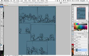 STEP 5: DIGITAL POST

Here it gets easy and mechanistic (and a little boring). Scan the finished artwork in at 300 dpi.
Open the resulting TIFF in Photoshop and run through a quick process:
- Set image size to 3200 pixels wide (I do the digital work at a way bigger size than the final strips so that future print collections would be easier)
- Copy the layer with the artwork; set the original artwork layer to invisible
- Rename the copied layer “Visible lines” (or some misspelled, jocular version of that) and in the Hue / Saturation settings, blast out all of the red pencil still visible. Threshold the layer to turn everything into pure black and white. Set the layer mode to “multiply.”
- Underneath the Visible Lines layer, create a new layer called something like “deep blue” and then fill the whole thing with a dull blue color. This is because I red somewhere that it’s easier to judge colors against a dull background than it is against a white one; having a dark background also helps with the anti-aliasing on the Vis Lines layer.
- Above the Deep Blue layer, create a Background Tones (or something like that) layer.
- Above Background Tones, create a Foreground Colors (or… you get the picture. Often, some bad French or Spanish makes its way into my layer names, for kicks) layer.
- Above Foreground Colors and still below Visible Lines, create a Gutters layer. Select the gutters on the Vis Lines layer, and fill that space on the Gutters layer with a tone close to black. I can’t really say why I always go with black gutters; I think I picked it up during a distant-past Hellboy / Mike Mignola phase.
 Once the layers are set, it’s pretty mechanistic. Use the Vis Lines layer to select an area, and dump color into either the foreground or background color layers depending on what’s what. Picking colors is pretty easy – I have a special palette saved with specific colors for, say, flesh, or maple guitar necks, or Jon’s hair. I also often pull up older strips to maintain continuity of room wall color, or instrument color.
Right now, I do foreground stuff in color and backgrounds in black and white to help keep the emphasis on the foreground. This keeps evolving as I go; sometimes I think it looks cheesy, but I don’t love the way things look in all-BW, and when I do all-color I don’t think I do a great job of making foreground colors pop. So the current setup is a compromise that I can live with for now, but don’t love. I’m probably overthinking it.
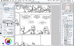 STEP 6: LETTER

I used to do my lettering in Photoshop, but that was imperfect – I didn’t have vectored balloons, so all speech and thought balloons were just white shapes laid on top of everything, with the practical result that I could never have the color white appear in a background because it might interfere with dialog (here’s an example of a strip lettered in PS, with white-shape-overlay balloons).
Now I use Manga Studio for lettering, because it has a pretty good set of vectored balloons. Lettering’s a tricky matter of keeping balloons a good size (which can mean cutting dialog) and in a good flow (which often depends on having made good choices back in the red line stage). I’ve learned to keep the top ~40% of a given panel clear for word balloons, which helps; I also like to leave big gutter spaces where possible, so that balloons can spill out if they need to.
I do a lot of last-minute dialog editing at this stage, too, trying to make sure that the jokes are actually funny and that the speech sounds at least sort of close to something real people would say.
Anyway, after everything’s lettered, I save a Manga Studio version in case I need to go back and fix typos and then convert back into Photoshop to finish things off (I should probably just learn how to do the whole thing in MS, but I have a good, long-established workflow in PS, and I’m a big believer in not fixing what ain’t broke, even though my reliance on an 8-year-old version of PS means that it probably WILL be broke pretty soon).
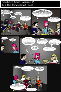 STEP 7: FINAL DIGITAL POST
The last Photoshop steps are too boring to go into much detail: shrink the image from 3200 pixels wide to the 800 that I use on the site (keeping the 3200 stored for theoretical future print collections). Add the header and title bar, thinking of the title at the last minute if I’m a lazy piece of shit on this cycle. Export as a PNG and upload to the site. Tell the world via Twitter and Facebook a couple of times. Immediately start fretting about the script for the next one.
Repeat ad nauseum.
One thing I forgot: Just assume that throughout the entire process, I’m looking at Twitter every four minutes.